Creating a peaceful and relaxing environment at home often starts with the colors you choose for your walls and decor. Calm colors can promote tranquility, reduce stress, and make your living spaces feel welcoming. Whether you are repainting a single room or redesigning your entire home, selecting the right tones is essential. This guide offers practical tips to help you choose calm colors that suit your style and needs.
Why Choose Calm Colors?
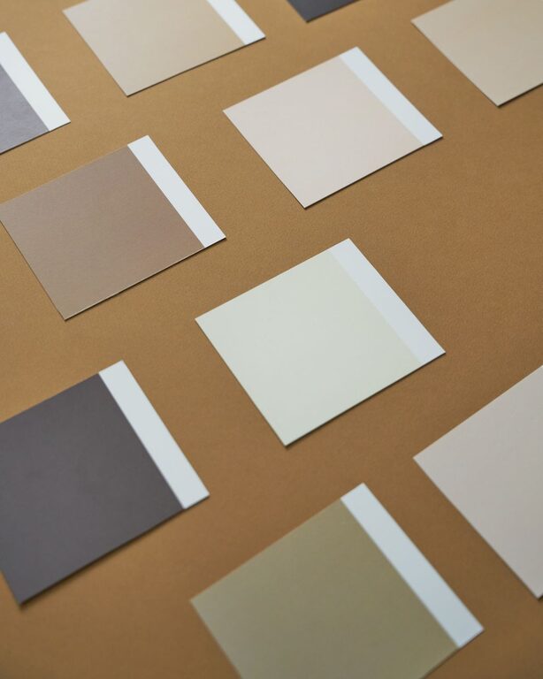
Calm colors tend to have a soothing effect on the mind and body. They help create a sense of balance and comfort, making it easier to unwind after a busy day. These colors are typically soft, muted, and understated, avoiding any harsh contrasts that might be overwhelming. Common calm colors include shades of blue, green, gray, beige, and soft pastels.
Understand the Mood You Want to Create
Before picking colors, think about the atmosphere you want in each room. Here are some common moods and the color families that tend to support them:
– Relaxing and Restful: Soft blues, light greens, and gentle grays can promote calmness and peace.
– Warm and Cozy: Earth tones like taupe, warm grays, and soft browns create a snug environment.
– Bright and Airy: Pale yellows, light beiges, and pastel tones add brightness without overwhelming energy.
Knowing the mood helps narrow down your options and guides your color choice.
Tips for Choosing Calm Colors
1. Start with Neutrals
Neutral colors such as beige, taupe, light gray, and off-white form a peaceful backdrop. They are versatile and pair well with almost any accent color. Neutrals help keep a space feeling open and can be easily updated later with new accessories or wall art.
2. Use Cool Tones
Cool colors like blue, green, and lavender tend to calm the mind and body. Light shades of these colors can make rooms feel more spacious and serene. For example, a pale blue bedroom can promote restful sleep, while soft green in the living room may evoke a natural, tranquil vibe.
3. Choose Muted Shades
Avoid overly bright or saturated colors, which can be energizing or distracting. Instead, opt for muted or pastel versions of your favorite hues. For example, dusty rose instead of bright pink, or sage green instead of vibrant emerald.
4. Consider the Lighting
Natural and artificial lighting affect how colors appear in a room. Test paint samples on your walls at different times of day to see how they look in sunlight and in the evening. A color that feels calm in bright light might seem dull in dim light, or vice versa.
5. Use Color Palettes for Balance
Using a color palette helps ensure harmony among your walls, furnishings, and accessories. One popular strategy is the 60-30-10 rule: 60% of the room in a calm base color, 30% in a secondary shade, and 10% in an accent color. This balance can keep the space visually interesting without overwhelming.
6. Mix Textures and Materials
Colors don’t work alone in creating calm spaces. Soft textures such as linen curtains, wool rugs, and cotton throws can soften a color’s impact and add warmth. Combining painted walls with natural materials like wood or stone complements calm colors beautifully.
7. Remember Personal Preferences
Your home should feel like a retreat. While experts suggest certain calm colors, it’s important to choose shades you personally enjoy. If you love lavender or soft peach, these can be calming too. Test samples and see how you feel living with the colors before committing.
Popular Calm Colors for Different Rooms
Bedroom
– Pale blue: promotes relaxation and encourages restful sleep.
– Soft gray: neutral and peaceful, works well with many decor styles.
– Lavender: subtle and soothing, adds a touch of gentle color.
Living Room
– Sage green: evokes nature and is easy on the eyes.
– Warm beige: creates a cozy, inviting atmosphere.
– Light taupe: balances warmth and neutrality.
Bathroom
– Aqua or seafoam green: fresh and refreshing without overwhelming.
– Soft white: clean and crisp, maximizes light.
– Pale gray: modern and calming.
Kitchen
– Light gray-blue: adds calmness to a busy space.
– Creamy white: bright yet soft, enhances cleanliness.
– Muted yellow: gentle warmth that keeps the kitchen cheerful.
Final Thoughts
Choosing calm colors for your home is about creating a space where you feel comfortable and relaxed. By considering lighting, personal taste, room function, and the mood you want to create, you can find colors that not only look beautiful but also foster peace and tranquility. Remember to sample your choices and allow time to see how a color feels as you live with it.
A calm color palette paired with thoughtful design will turn your home into a true sanctuary—one that nurtures your well-being every day. Happy decorating!